Can you put a logo inside a QR code?

A logo can make a QR code look like it belongs to your brand instead of something pasted onto the design at the last minute. But adding a logo also removes or covers part of the QR pattern, and that can make the code harder to scan.
The safest approach is simple: keep the logo modest, place it near the center, use strong contrast, select a higher error correction level, preserve the clear border around the QR code, and test the finished design on several phones.
With the free QR code generator, you can create a QR code, add a logo, adjust its appearance, choose an error correction level, and download the result for digital or print use.
The important part comes before you publish it: scan the exact version people will see.
Can you put a logo inside a QR code?
Yes. QR codes include error correction, which allows a scanner to recover some information when part of the symbol is dirty, damaged, or obscured.
That is why a small logo can sit over part of a QR code while the code still works.
QR codes have four error correction levels: L, M, Q, and H. According to DENSO WAVE, which developed the QR Code, these levels provide increasing amounts of data restoration. Level L is approximately 7%, M about 15%, Q about 25%, and H about 30% of codewords. DENSO WAVE: QR Code error correction
There is an important catch.
Those percentages are error correction rates for codewords. They do not mean you can safely cover 30% of a QR code with a logo when using Level H. A QR symbol also contains structural elements that scanners need to locate, orient, and decode the code.
Treat error correction as extra tolerance, not permission to hide a large chunk of the QR pattern.
What parts of a QR code should the logo avoid?
The three large squares in the upper-left, upper-right, and lower-left corners are finder patterns. Phones use them to recognize the QR code and work out its orientation.
Do not cover them.
QR codes also contain timing patterns, alignment patterns, format information, and other functional areas. Their exact arrangement depends partly on the QR version.
This is why dropping a large logo anywhere that "looks empty enough" is risky.
For a normal branded QR code, the center is usually the most practical place for a logo because it keeps the obvious corner finder patterns untouched. A good QR generator should handle the placement for you, but the final code still needs testing.
If you want more background on the structure and types of QR codes before customizing one, see the QR code guide.
Step 1: Start with the shortest practical content
Before worrying about the logo, keep the QR code itself as simple as you reasonably can.
A QR code containing a short URL generally needs fewer modules than one containing a very long URL with tracking parameters and other data. As the amount of encoded data rises, the QR symbol may need more modules.
That matters because a dense QR code gives every printed module less physical space when the overall QR code stays the same size.
For a website, open the URL QR code generator and enter the page you want the QR code to open.
If you control the destination URL, a clean address such as:
https://example.com/menu
is usually easier to work with than a very long address packed with query parameters.
Do not use a shorter URL merely for appearance if doing so introduces an unreliable redirect service. The destination still needs to work months or years after the QR code is printed.
Step 2: Add your logo
Upload the logo you want to place inside the QR code.
Simple logos tend to work better here. A QR code is a small technical symbol, so tiny lettering and fine illustration inside a logo can become unreadable long before the QR code itself becomes unreadable.
A square or compact logo is usually easier to fit than a very wide wordmark.
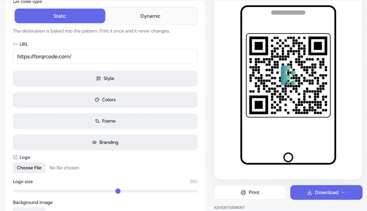
If your complete company logo contains a symbol plus a long business name, consider using just the recognizable symbol inside the QR code and placing the company name elsewhere in the design.
Leave some QR pattern visible around the logo. If the logo starts dominating the code, make it smaller.
There is no universal logo percentage that guarantees a successful scan. QR complexity, error correction, print size, contrast, camera quality, viewing distance, and the location of the covered modules all affect the result.
So a percentage alone is a poor test. Your phone is a better one.
Step 3: Choose Q or H error correction
For an ordinary QR code without anything covering it, lower error correction may be enough.
A logo changes the situation because it intentionally hides some of the QR data.
ForQRCode supports the standard L, M, Q, and H error correction settings. When using a logo, Q or H is the sensible place to start.
Higher error correction adds more redundancy, giving the scanner more information it can use when some parts cannot be read.
There is a tradeoff. Higher error correction can make a QR code denser because more error correction information has to be stored.
That means selecting H does not automatically solve every design problem. A huge logo over a tiny, highly customized QR code can still fail.
Start with Q or H, keep the logo small, then test.
Step 4: Keep strong contrast
Black modules on a white background are easy for scanners to distinguish. You can change those colors, but the basic relationship should remain clear: the QR pattern needs to stand out from its background.
Dark blue on white can work well. Dark green on a pale background may also scan without trouble.
Pale gray on white is a much worse bet.
Be especially careful with gradients, transparent backgrounds, photographs, textures, and colors that are similar in brightness.
The logo itself also matters. If a dark logo merges into the modules around it, its edges may become difficult to distinguish. A small light-colored area behind the logo can sometimes make the separation cleaner, provided you are not covering too much of the QR pattern.
A simple design usually scans faster than an elaborate one.
Step 5: Protect the quiet zone
The blank border around a QR code is not wasted space. It is part of making the code easy for scanners to recognize.
This area is called the quiet zone.
DENSO WAVE specifies a clear margin four modules wide around all sides of a standard QR Code. Nothing should be printed inside that space. DENSO WAVE: QR Code quiet zone guidance
Do not push your logo, text, decorative frame, photograph, or another graphic against the QR pattern.
This mistake often happens after the QR code leaves the generator. The code itself is fine, but a designer crops it tightly when inserting it into packaging or a poster.
Keep the original clear border.
The QR Code symbology itself is standardized under ISO/IEC 18004, which defines aspects including symbol formats, dimensions, encoding, and error correction. ISO
Step 6: Do not make the QR code too small
A QR code with a logo deserves a little more breathing room than a basic black-and-white code.
There is no single print size that works for every QR code. The correct size depends on module count, printing method, scanning distance, and the environment where people will use it.
A code on a business card may be scanned from close range. One on a shop window may need to work from farther away.
Rather than searching for a magic minimum size, test the final design at its actual dimensions.
Print it.
Put it where it will be used.
Then try scanning it naturally rather than holding the phone in the perfect position.
If it feels fussy, make the code larger.
Step 7: Avoid excessive QR styling
Rounded modules, custom corner shapes, unusual colors, frames, gradients, and logos can all change how a QR code looks.
You do not need to use every option at once.
A QR code with a logo already has one element interfering with the normal pattern. If you also change every module shape, reduce the contrast, add a gradient, and squeeze the quiet zone, you give scanners several problems to solve at the same time.
Branding usually works better when you pick one or two changes.
For example, use your brand color for the QR modules and add your logo in the center, while leaving the background light and the finder patterns easy to recognize.
That still looks custom without making the QR code fight for its life.
Step 8: Download the right file format
Once the design is finished, download a format suited to where the QR code will appear.
ForQRCode supports PNG, SVG, PDF, and EPS exports.
PNG is convenient for websites, presentations, documents, and many everyday graphics.
For print design, SVG, PDF, or EPS can be a better choice because vector artwork can be resized without turning the QR modules blurry.
Avoid taking a tiny raster image and enlarging it for a poster or package. Soft edges make the modules harder for a camera to distinguish.
The free QR code generator lets you create and export the QR code in the format that fits your project.
Step 9: Test the exported QR code, not just the preview
This is the step people skip.
A QR code working inside the generator preview does not prove that the final poster, label, menu, or package will scan.
Test the exported image first. Then, if it is going to print, test a printed sample at the intended size.
Try more than one phone if possible. An older phone, a current iPhone, and an Android device may not behave exactly the same way.
Change the conditions too. Scan it:
from the expected viewing distance
under ordinary indoor or outdoor lighting
with the printed material held at a slight angle
after placing it in the actual surrounding design
If you have saved the QR code as an image and want to verify what it contains, the free QR code reader and scanner can decode QR codes from an uploaded image or camera.
A code that takes several attempts to scan needs work, even if it eventually succeeds.
Why does my QR code with a logo not scan?
The logo is often blamed first, but several things may be happening.
The logo may simply be too large. Reduce it and generate the code again.
Low contrast is another common problem. Make the modules darker or the background lighter.
The QR code may also be too small for the amount of data it contains. Enlarging the final code can solve that.
Check the quiet zone. A border, photo, or line placed too close to the modules can interfere with detection.
And check the source file. If the QR code has been resized badly, compressed, blurred, or exported at low resolution, go back to the original and use a cleaner format.
Fix one thing at a time and test again. Otherwise, you will not know which change solved the problem.
What is the best error correction level for a QR code with a logo?
Q or H is a good starting point for logo QR codes because both provide more error correction than L or M.
DENSO WAVE lists approximate restoration rates of 25% for Level Q and 30% for Level H. Again, these figures refer to codeword restoration and should not be treated as a safe percentage of the QR image that your logo can cover. QRCode
H gives more correction capacity, but it may produce a denser code. The right choice is the one that scans reliably in the final design.
Testing decides that.
FAQ
Can a logo make a QR code unreadable?
Yes. A logo can make a QR code unreadable if it covers too much of the symbol or interferes with areas needed for detection and decoding. Keep the logo small, place it near the center, use Q or H error correction, and test the finished code.
Where should a logo go on a QR code?
The center is usually the safest practical location. Avoid covering the three large finder patterns in the corners and preserve the clear quiet zone around the entire QR code.
Should I use a white background behind the logo?
A light area behind a logo can help separate it from the QR modules, especially when the logo contains dark colors. Keep that background area small because it also covers QR data.
Is Level H always best for a logo QR code?
No. Level H provides the highest standard error correction level, but it can also increase QR density. Q may be enough for a modest logo. Generate both if necessary and test them at the final size.
How do I know if my branded QR code is safe to print?
Print a sample at the final size and scan it with several phones under realistic conditions. If scanning is slow or inconsistent, increase the QR size, reduce the logo, simplify the styling, or improve contrast before ordering the full print run.
A good logo QR code should still feel boring to scan
People scanning your QR code should not notice the technical work behind it. They point their camera, the code is recognized, and the destination opens.
That is the standard to aim for.
Use the logo to make the code recognizable, but do not let branding take over the QR pattern. Start with a clean code, use Q or H error correction, preserve the quiet zone, keep the logo modest, and test the actual output.
You can build the branded version with ForQRCode's free QR code generator. Once it is in the final poster, menu, card, package, or sign, scan it one last time before publishing.